
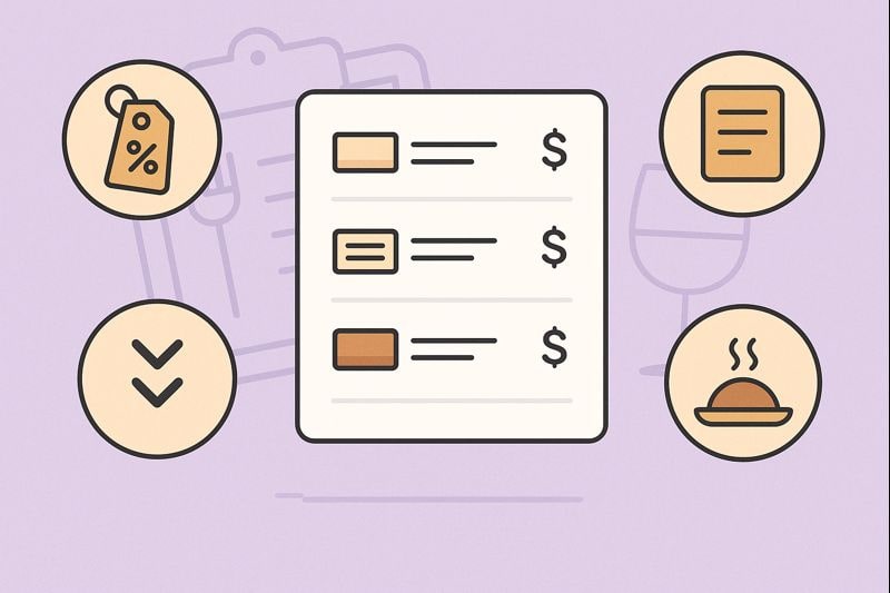
Best Menu Design Tips That Increase Sales
If you run a restaurant, café, food truck, or bar in Delaware, your menu is not just a list of dishes. It’s a silent salesperson that works every hour you’re open. The best menu design tips that increase sales combine psychology, layout, pricing, and storytelling so guests happily spend more while still feeling great about their choices.
Modern menu design is also changing fast. Guests now move between physical menus, QR code menus, online ordering, and delivery apps. At the same time, operators face higher labor and food costs and new regulations around packaging and waste.
A smart menu can help you protect margins, highlight your most profitable items, and deliver a smoother guest experience both in-house and online.
In this guide, we’ll walk through practical menu design tips that increase sales, tailored for local operators. You’ll see how to use menu psychology, engineering, digital tools, and local trends to build a menu that works harder for your business today and is ready for where the industry is going next.
Why Menu Design Matters for Restaurant Sales Today

Menu design as your most profitable marketing tool
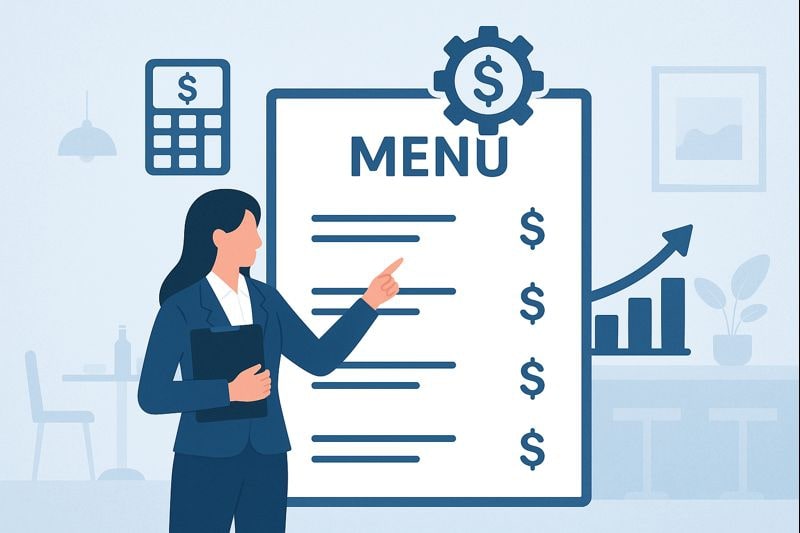
Many restaurants spend heavily on social media, ads, and promotions but treat their menu like a simple price list. That’s a missed opportunity.
Your menu is the one marketing asset every guest sees right before they decide what to buy. The best menu design tips that increase sales start with understanding that your menu is a profit engine, not just a piece of paper.
Research on menu psychology shows that layout, wording, and visual cues significantly affect what guests order and how much they spend.
A well-designed menu can push diners toward higher-margin dishes, encourage add-ons, and make premium options feel like the natural choice. You’re not tricking anyone; you’re making it easier for guests to notice what you do best.
Menu design also shapes your brand. Clean, modern layouts signal quality and consistency. Cluttered or outdated menus suggest corner-cutting or a lack of attention to detail. When inflation and competition are high, guests want to feel confident that they’re getting value.
Your menu’s typography, spacing, and category structure all send subtle messages about the experience they can expect.
Finally, menus are relatively low-cost to upgrade compared with renovations or big marketing campaigns. A focused menu redesign—guided by tested menu design tips that increase sales—can improve average check size without adding staff or new equipment. That’s why industry consultants often call menu engineering one of the highest-ROI tools in foodservice.
How guests actually read menus: the “Golden Triangle” and more
One of the most powerful menu design tips that increase sales is to design for real human eye patterns, not for what looks “pretty” in isolation. When someone opens a menu, they don’t read it like a novel.
They scan. Eye-tracking studies show that diners tend to look first at the center of the page, then move to the top-right, then the top-left. This pattern is often called the “Golden Triangle.”
Knowing this, you can place your highest-margin “star” items—those with strong popularity and strong profits—in these hot zones. You can highlight a best-selling entrée in the center, a signature cocktail in the top-right, and a profitable appetizer in the top-left. Even small changes like moving a high-margin dish into a hot zone can shift ordering patterns.
Modern menu design research also emphasizes:
- Anchoring: Positioning a very high-priced item near other options makes the rest of the menu feel more affordable and nudges guests toward mid-to-high-priced choices.
- Limited choice: Too many options create decision fatigue. A focused selection in each category helps guests feel confident and order faster.
- Visual hierarchy: Using bold fonts, boxes, icons, and spacing to guide the eye toward profitable dishes without overwhelming the page.
As menus increasingly appear on screens—not just in print—these principles still apply. Digital menus and online ordering interfaces should also reflect eye-tracking patterns, placing high-margin or recommended items in the positions that guests notice first.
Foundations of a High-Converting Menu Layout
Use the Golden Triangle and scanning patterns in your layout
To apply menu design tips that increase sales, start by sketching your layout around how diners actually scan information. For a single-page menu, place your most profitable categories in the main Golden Triangle zone: the center and upper sections.
For multi-page menus, treat each page as its own mini-triangle and avoid burying key items in corners or near the fold.
On paper menus, you can emphasize these hot spots by:
- Using a slightly larger or bolder font for featured items.
- Adding a subtle box or shaded background behind a “Chef’s Favorites” section.
- Using icons (such as a small star or chef’s hat) next to high-margin dishes.
On digital or QR menus, you can mirror these menu design tips that increase sales by:
- Pinning “Popular” or “Recommended” items at the top of each category.
- Using larger photos for a few core dishes instead of tiny images for everything.
- Ensuring the first screen a guest sees includes at least one premium entrée and one profitable appetizer.
Try not to divide your menu into too many pages or screens. Each additional tap is a chance for the guest to get distracted or abandon ordering. Keep the number of categories tight and lead with the sections you most want to sell—usually appetizers, signature mains, and beverage programs like cocktails or specialty coffee.
Structure categories around profit, not just cuisine
A common mistake is structuring the menu only by cuisine type (e.g., “Burgers,” “Pasta,” “Seafood”) without considering profitability. Menu engineering suggests categorizing items into four groups: Stars, Plowhorses, Puzzles, and Dogs.
- Stars: High popularity, high profit. These are your heroes.
- Plowhorses: High popularity, low profit. Loved by guests but tough on margins.
- Puzzles: Low popularity, high profit. Great margins but under-ordered.
- Dogs: Low popularity, low profit. Usually candidates are removed.
When applying menu design tips that increase sales, you want your Stars to be extremely visible and easy to order. Place them in prime real estate and highlight them visually. For Plowhorses, consider portion or recipe adjustments to improve margins, then keep them in visible but less prominent spots.
Puzzles deserve special attention. Instead of dropping them, try renaming them with more evocative language, adding a mouthwatering description, or pairing them with a high-quality photo. Often, one or two menu design tweaks can turn a Puzzle into a Star.
Dogs, especially those that require unique ingredients or prep, should be removed over time. This frees space on the menu and in your operations for dishes that truly drive profit.
In Delaware’s competitive restaurant landscape, simplifying your menu can help you manage labor and food costs more effectively while focusing on items with the best return.
Use white space, typography, and hierarchy to guide choices
Good menu design tips that increase sales are not about cramming in as many items as possible. White space—empty areas between items and sections—is your friend. It makes the menu easier to scan, helps important dishes stand out, and signals a more upscale, confident brand.
A few practical rules:
- Limit items per category: 5–7 options in each section is usually enough.
- Use consistent typography: Choose one or two fonts and use size, bold, and italics consistently across categories.
- Create a clear hierarchy: Category titles larger than item names, item names larger than descriptions, descriptions smaller and lighter.
On digital menus, apply a similar hierarchy with font size and spacing. Ensure that on a phone screen, guests can easily distinguish category headings from individual dishes without pinching and zooming.
Visually, consider how your menu aligns with your brand. A casual bar may use bolder, playful fonts, while a fine-dining spot might lean on minimalist typography.
Either way, your hierarchy should make it obvious what to read first and what matters most—your high-margin items, your specials, and your beverage program. This is where seemingly small design choices turn into menu design tips that increase sales in the real world.
Pricing and Profit Engineering on the Menu
Apply menu engineering: stars, plowhorses, puzzles, and dogs
Menu engineering is one of the core menu design tips that increase sales and profit at the same time. Once you’ve calculated the food cost and contribution margin of each item, you can decide where to place them on the menu and how to present them.
For Stars, keep recipes consistent, ensure you never 86 them if possible, and promote them visually. Use boxes, callout labels like “House Favorite,” and strategic placement in the Golden Triangle.
For Plowhorses, you have a few options. You might slightly raise the price if the market allows, reduce portion sizes, or adjust ingredients to increase margin without hurting perceived value. Once you do, reevaluate their category. If your Plowhorse becomes more profitable, treat it like a Star in your layout.
Puzzles need storytelling, not just a spot on the page. Maybe your premium seafood dish is priced higher, so guests scroll past it. Pair it with a compelling description, place it next to slightly more expensive items to create a value contrast, and train staff to highlight it as a recommendation.
Dogs can be repurposed (for example, by turning components into specials) or removed. When you trim dogs, your menu becomes leaner, easier to navigate, and more profitable. Over time, systematically applying these menu design tips that increase sales ensures you’re not wasting menu real estate on items that don’t help your bottom line.
Use smart price presentation to reduce “sticker shock”
How you display prices matters as much as the number itself. Studies in menu psychology show that:
- Removing currency symbols reduces price sensitivity.
- Avoiding price columns discourages guests from “shopping” by cost alone.
- Charm pricing (e.g., 14.95 instead of 15.00) can subtly influence perception.
To put these menu design tips that increase sales into practice:
- Use prices at the end of descriptions, not in a vertical list that’s easy to scan.
- Drop the currency symbol (just “14” or “14.95”) for dine-in menus.
- Align prices in a way that doesn’t create a perfect price column—small offsets work well.
You can also use price anchoring. Include one or two premium dishes at the high end of your price range. Even if they’re ordered less often, they make your mid-range items seem more affordable. For example, a 42-dollar steak can make a 29-dollar seafood entrée look like a smart, reasonable choice.
In the future, as dynamic pricing tech becomes more common, especially in digital menus and ordering apps, restaurants may adjust prices by time of day or demand. Even then, the fundamentals remain: present prices in a way that feels smooth and natural, not confrontational.
Build bundles, add-ons, and check-size boosters into the menu
Another set of menu design tips that increase sales focuses on how items relate to each other, not just on individual prices. Smart bundling and add-ons can boost average check size without making guests feel upsold.
Consider:
- Combo meals: A “Local Lunch Combo” with a sandwich, side, and drink at a slightly better value than ordering separately.
- Add-on prompts: “Add bacon,” “Add shrimp,” or “Make it a platter” options clearly displayed under main dishes.
- Shareables: Highlight sharable appetizers, boards, and dessert platters in a special section.
Visually group bundles and add-ons so they’re easy to see. On digital menus, use buttons like “Make it a combo” that show the incremental price. On paper, use a slightly indented line under the main item name.
In Delaware’s busy tourist seasons, these menu design tips that increase sales can help you serve groups faster and increase revenue per table. Families and visitor groups often appreciate clear bundle options that simplify decision-making while delivering perceived value.
Copywriting and Photography That Sell Dishes
Use descriptive language and storytelling to increase perceived value
The words you use are just as important as layout and pricing. Research shows that descriptive menu language increases perceived value and willingness to pay, especially when it references origin, preparation methods, and sensory details.
Instead of “Grilled Salmon,” consider:
“Cedar-Grilled Atlantic Salmon with lemon-herb butter, served over roasted seasonal vegetables.”
This is one of the menu design tips that increase sales by making dishes feel special, even if your food cost hasn’t changed. A few guidelines:
- Highlight origins: local farms, regional styles, coastal seafood.
- Emphasize cooking methods: slow-roasted, char-grilled, wood-fired, house-smoked.
- Add sensory words: crisp, creamy, smoky, bright, zesty, tender.
Keep descriptions concise and readable. Aim for two to three short sentences rather than a long block of text. On digital menus, ensure descriptions truncate gracefully on phones, but allow guests to tap for more detail when needed.
Over the next few years, AI-assisted menu tools may help generate or optimize descriptions based on guest behavior data. Still, the human touch—knowing your concept, your neighborhood, and your local tastes—will remain crucial in writing copy that feels authentic.
Use photos and icons strategically, not excessively
Photos can be powerful menu design tips that increase sales, especially for visually striking dishes. But too many images can cheapen your brand or slow down digital menus. Use photos selectively for:
- Signature dishes and high-margin specials.
- Visually unique items (towering burgers, colorful bowls, desserts, cocktails).
- New items that guests haven’t seen before.
Keep photography consistent in style, lighting, and plate presentation. What guests see on the menu should look like what arrives at the table. Over-promising with heavily edited photos can damage trust and lead to poor reviews.
Icons also matter. Simple icons can mark:
- Vegetarian, vegan, and gluten-friendly options.
- Spicy dishes.
- Local favorites or chef recommendations.
On QR and digital menus, ensure icons are tap-friendly and have clear tooltips or legends. Consistent iconography helps guests with dietary needs or preferences quickly find what they want, improving satisfaction and reducing back-and-forth with staff.
As digital signage and tablet menus become more affordable, expect more restaurants to use short looping videos of hero dishes instead of static images. These micro-videos, paired with the same menu design tips that increase sales, will become a key competitive edge for visual storytelling.
Make your menu accessible and easy to read for everyone
Accessibility is both a legal and ethical priority—and a smart business move. Clear, readable menus make it easier for all guests, including older diners and those with visual impairments, to order confidently.
Practical accessibility-focused menu design tips that increase sales include:
- Using high-contrast text and background colors.
- Avoiding overly decorative fonts for main text.
- Ensuring font sizes are large enough, particularly on printed menus in low light.
- Providing at least one menu with a very large print.
- Making sure online and PDF menus work with screen readers.
For QR menus, optimize your site or app for mobile accessibility. Text should resize cleanly, buttons must be large enough to tap, and color choices should work for guests with color blindness.
As regulations and guest expectations evolve, accessible menu design will increasingly be a baseline requirement—not an optional upgrade. Restaurants that adopt these practices early will not only avoid issues but also attract loyal guests who feel seen and cared for.
Designing Menus for Local Diners and Visitors in Delaware
Feature local ingredients, seasons, and coastal identity
Local pride is a powerful sales driver. One of the best menu design tips that increase sales for Delaware operators is to showcase local ingredients and flavors. Guests—especially tourists—often seek out dishes that “feel local.”
Consider:
- Calling out local farms and producers in descriptions.
- Highlighting seasonal items tied to local harvests or fisheries.
- Creating a “Delaware Favorites” section with local twists on classics.
You might feature seasonal crab dishes, coastal seafood, or desserts inspired by regional flavors. Communicate these clearly on the menu with labels like “Local Catch of the Day” or “Sourced from regional farms.” This taps into the broader industry trend toward authenticity and locality.
With climate and supply-chain shifts, local sourcing may become even more important in the future. Building your menu around ingredients you can reliably get from nearby partners can stabilize your costs while giving you a strong brand story.
Reflect regulations, sustainability, and waste reduction on the menu
Operators in the state are adapting to new rules on packaging, including bans on certain Styrofoam containers and potential limits on automatically handing out single-use items like cutlery, napkins, and condiment packets.
Your menu can support these changes and turn them into a positive part of your brand story, rather than an inconvenience.
Practical menu design tips that increase sales while aligning with these rules include:
- Adding a small note: “We provide condiments and disposable utensils upon request to reduce waste.”
- Offering clearly labeled “to-go friendly” dishes that travel well in eco-friendly packaging.
- Promoting reusable or returnable container programs where applicable.
Guests increasingly care about environmental impact. When your menu explains the “why” behind small changes, many are willing to support them—and may favor your restaurant over others that feel out-of-step with current values.
In the coming years, expect more regulations and guest expectations around sustainability. Menus that clearly communicate eco-conscious choices—without lecturing—will stand out and support long-term loyalty.
Match menu design to neighborhood, tourists, and regulars
Menu design tips that increase sales must be tailored to your specific location and clientele. A fast-casual spot near office buildings will have different needs than a waterfront restaurant serving seasonal tourists.
For business-heavy areas, emphasize:
- Clear, fast lunch combos.
- Highly legible menus that make it easy to decide quickly.
- Online menus optimized for mobile so guests can check options before walking over.
For tourist-heavy zones, focus on:
- Local specialties and photo-worthy dishes clearly marked.
- Multi-lingual descriptions or icons if you see many international visitors.
- Clear pricing and value messaging to build trust with guests unfamiliar with the area.
In residential neighborhoods, repeat guests drive long-term success. Consider rotating specials, loyalty program tie-ins, and seasonal features. Keep your core menu stable but use callouts and inserts to refresh interest regularly. Over time, these local menu design decisions build a strong reputation and steady word-of-mouth.
Digital, QR, and Mobile Menus That Increase Sales
Use QR code menus that guests actually like
QR code menus exploded during the pandemic and remain widely used. But not all guests love them. Recent surveys show mixed feelings—some diners value speed and convenience, others miss the tactile experience of printed menus.
To turn QR menus into menu design tips that increase sales instead of a pain point:
- Make the QR code easy to scan with clear signage on tables.
- Ensure the landing page loads fast and is mobile-first.
- Keep navigation simple: categories at the top, featured specials up front.
- Offer at least one printed menu for guests who prefer it or have tech limitations.
A recent academic study found that QR menus can improve operational efficiency and streamline ordering when well integrated. But security concerns and “quishing” scams also mean you should use official-looking, branded QR codes and avoid random stickers that can be replaced.
Going forward, expect QR menus to evolve into richer experiences with dynamic specials, upsell prompts, and even table-specific offers. Restaurants that design QR menus with the same care as print menus will be positioned to get the most benefit.
Optimize your online menu for search, delivery, and reviews
Your menu doesn’t just live on the table. Guests discover your dishes through Google, Maps, social media, and third-party delivery platforms. Online menu design tips that increase sales include:
- Using clear category names and keywords in item titles (e.g., “Crab Cake Sandwich,” “Wood-Fired Pizza”).
- Keeping pricing and items consistent across your website, Google Business Profile, and delivery apps.
- Uploading high-quality photos of your most popular and profitable items.
Many guests decide whether to visit based on your digital menu alone. If your online menu is missing, outdated, or hard to read on a phone, they’ll keep scrolling. Make sure your website’s menu page loads quickly, uses readable fonts, and is easy to share.
Search engines also pick up on descriptive language. Including terms people search for—like “family-friendly,” “happy hour,” “gluten-free options,” or “late-night bites”—within natural-sounding descriptions can help you rank for local searches without stuffing keywords.
As AI-driven recommendations expand in map apps and delivery platforms, having well-structured, clearly described items will help algorithms correctly categorize and recommend your dishes to nearby diners.
Use data, testing, and feedback to keep improving
The best menu design tips that increase sales are not “one and done.” They’re part of an ongoing process of testing, measurement, and refinement. Use your POS and online ordering data to track:
- Which items sell most often.
- Which items deliver the best contribution margin.
- How new items perform after a design or copy change.
Try A/B testing when possible: change a description, price, or photo for a small period and compare results. Digital menus and delivery platforms make this easier than ever.
Industry trend reports show that operators are increasingly relying on data and automation to navigate labor and cost pressures. Bringing that mindset to menu design turns your menu into a living, evolving asset that keeps getting sharper over time.
Future Trends in Menu Design and How to Prepare
AI, personalization, and dynamic pricing on menus
In the next few years, menu design will be influenced by AI and personalization. Some concepts are already experimenting with:
- Suggesting items based on previous orders.
- Adjusting recommendations by time of day, weather, or events.
- Dynamically adjusting prices for delivery versus dine-in.
For independent operators and small regional groups, fully dynamic pricing may take longer to adopt. But you can still prepare by:
- Keeping your menu data structured and clean in your POS and online platforms.
- Using categories like “Popular,” “New,” or “Recommended” that can easily be updated.
- Being open to limited tests, like weekday lunch specials or early-bird discounts shown primarily on digital menus.
As AI tools for copywriting, translation, and menu layout become more mainstream, they can help you generate more ideas and variations. Just remember that the best menu design tips that increase sales will still depend on your local knowledge—what your guests actually want and how your team can deliver consistently.
Sustainability, health trends, and transparent menus
Guests are paying closer attention to health, ingredients, and environmental impact. Menu design tips that increase sales in the future will increasingly include:
- Clear labeling of plant-based, vegetarian, and gluten-friendly options.
- Transparent information on allergens and major ingredients.
- Highlighting lighter options, smaller portions, or shareable plates.
Industry trend reports indicate growing demand for menu “freshness” and more health-conscious choices, even in comfort-food concepts. Operators that proactively design their menu around these expectations—without sacrificing flavor or indulgence—will be better positioned.
Menus may also incorporate carbon-footprint information, sourcing certifications, or sustainability badges as these become standardized. While that may sound complex today, starting simple with local sourcing notes and clear labeling will help you adapt more easily when expectations grow.
Common Menu Design Mistakes That Cost You Sales
Overcrowded menus and decision fatigue
One of the most common menu design mistakes is trying to please everyone with endless options. Too many items lead to decision fatigue, slower table turns, and higher food waste. Guests may default to the cheapest or most familiar items, hurting your margins.
Practical menu design tips that increase sales by tackling this issue include:
- Trimming each category to your top sellers and best-margin items.
- Rotating limited-time specials instead of permanently expanding the core menu.
- Removing duplicate or overlapping dishes that compete with each other.
When you simplify your menu, you:
- Make it easier for guests to decide.
- Reduce errors and ticket times in the kitchen.
- Lower inventory complexity and waste.
In a landscape where labor and food costs are major pressures, a tighter, better-designed menu is often more profitable than a big, complicated one. Operators who resist the urge to add “just one more” permanent item tend to see smoother operations and happier guests.
Inconsistent branding and confusing navigation
Another issue that undermines menu design tips that increase sales is inconsistency. If your menu’s tone, design, and structure don’t match your brand, guests may feel confused about what kind of experience to expect.
Red flags include:
- Using different fonts and colors with no clear pattern.
- Mixing casual slang with formal descriptions.
- Listing categories in a confusing order (e.g., desserts before mains).
- Having different item names or prices on print vs. digital vs. third-party menus.
Your menu should feel like a natural extension of your logo, décor, and service style. A relaxed beach bar can use playful section titles and bright accents, while a modern bistro might prefer minimalism and elegance. The key is consistency across printed menus, QR menus, online menus, and delivery listings.
Navigation is just as important. Guests shouldn’t have to hunt for appetizers, kids’ options, or vegetarian dishes. Clear section headings, logical ordering, and helpful icons all support smoother ordering—and that’s exactly what menu design tips that increase sales aim to achieve.
How to Implement These Menu Design Tips Step-by-Step
Quick wins you can execute in the next 30 days
You don’t have to rebuild everything at once. Start by choosing a few menu design tips that increase sales and implement them in stages.
In the next month, you could:
- Identify Stars and Dogs using sales and margin data.
- Reposition Stars into Golden Triangle hot spots and highlight them visually.
- Update descriptions for your top 10 items with more sensory, specific language.
- Clean up pricing display by removing currency symbols and avoiding price columns.
- Trim at least a few Dogs from each category to reduce clutter.
If you use a digital menu or QR system, make these changes there as well. Monitor sales and guest feedback over a few weeks. Often, you’ll see shifts in ordering patterns quickly, especially around highlighted items.
As you gain confidence, introduce more advanced menu design tips that increase sales, such as bundles, anchor pricing, and seasonal local sections. Build a simple internal checklist to review your menu every quarter—layout, pricing, descriptions, photos, and online consistency.
When to hire a professional menu designer or consultant
Sometimes, the fastest route to a high-performing menu is bringing in outside expertise. Consider hiring a menu designer, brand strategist, or restaurant consultant when:
- You’re rebranding or opening a new concept.
- Your menu has grown messy over years of small changes.
- You’re planning to invest in new signage, digital boards, or a full website redesign.
- You want a holistic review of pricing, positioning, and guest experience.
Professionals who specialize in menu design tips that increase sales will combine visual design, copywriting, and menu engineering with your local market knowledge. They can also help you avoid costly printing mistakes or clunky digital experiences.
Even if you hire help once, keep the skills you’ve learned. Over time, your internal team can maintain and tweak the menu—responding quickly to cost changes, guest feedback, and local trends—without always needing external support.
FAQs
Q.1: How often should I redesign or update my menu?
Answer: Most restaurants benefit from a minor menu refresh every 3–4 months and a more significant redesign every 12–18 months. Seasonal updates let you feature fresh ingredients, test new dishes, and adjust prices as costs change. A full redesign is helpful when your brand, market, or cost structure has shifted significantly.
Regular updates are one of the menu design tips that increase sales because they give you a chance to promote new items, highlight seasonal specials, and remove underperforming dishes before they drag down margins. Just avoid changing so often that regular guests feel lost.
Q.2: Do QR code menus really increase sales, or do guests hate them?
Answer: QR code menus can increase sales when they’re fast, intuitive, and paired with good design. They let you:
- Update items and prices instantly.
- Feature daily specials without reprinting.
- Gather data on what guests view and order.
However, some guests dislike QR-only experiences. The best approach is hybrid: offer both a polished, accessible physical menu and a well-designed QR menu. This way, you get the operational benefits while respecting guest preferences. How you design and organize the digital menu matters just as much as the decision to use QR codes in the first place.
Q.3: What’s the single biggest menu design mistake to avoid?
Answer: The biggest mistake is designing your menu around what you like rather than what your guests buy and what your business needs. That usually shows up as:
- Too many items.
- Poor visibility for high-margin dishes.
- Confusing layout or navigation.
- Outdated prices and sloppy online menus.
If you focus on data, guest behavior, and profitability, you’ll naturally gravitate toward menu design tips that increase sales—simpler categories, clear hierarchy, highlighted Stars, and strategic pricing.
Q.4: How can I measure whether my new menu design is working?
Answer: To see if your menu design tips that increase sales are paying off, track:
- Average check size before and after the change.
- Sales mix of key items (especially Stars and Puzzles).
- Food cost percentage and contribution margin.
- Table turn times and order accuracy.
- Guest feedback and online reviews about menu clarity.
Ideally, compare at least four to six weeks before and after a major menu change, adjusting for seasonality. For digital menus, look at click and view data as well: which items get viewed but not ordered, and which get ordered frequently after a layout change.
Conclusion
When you put it all together, the best menu design tips that increase sales are about clarity, psychology, and alignment with your brand and local market. A strong menu:
- Guides guests naturally to profitable, satisfying choices.
- Reflects your identity and local flavors.
- Respects new realities like digital ordering, regulations, and sustainability.
- Evolves based on data and guest feedback.
You don’t have to implement everything at once. Start with a few high-impact changes: highlight your Stars, tidy up your layout, refine your descriptions, and align your print, QR, and online menus. Over time, your menu becomes a living asset that grows smarter with every season.
In a challenging restaurant environment, especially for local operators balancing rising costs and changing guest expectations, a thoughtfully engineered menu is one of the most powerful tools you have. Treat it like your most dedicated salesperson—and it will reward you with higher checks, happier guests, and a healthier bottom line.